Showing posts with label Design. Show all posts

Friday, September 20, 2013

A "Frozen" Rita?

A 1998 Sample of My College Newspaper Comic Strip Bill & Rita
© 2013 by Dan Cunningham

Frequent readers of this blog likely observe a distance from an editorial directionnor does I Can Break Away maintain much account of personal life beyond presenting original artwork, or minor anecdotes on the topic at hand. This post will place itself somewhere in the middle of that framework, due to the tenuous connection of the subjects in this post.

One-Sheet Teaser Poster for Walt Disney Animation's Upcoming Feature Frozen
Image Courtesy of moviepilot.com
© Disney

Initial marketing and advertising campaign has commenced for the forthcoming animated feature Frozen from the Walt Disney Animation Studio (slated for U.S. release on Thanksgiving week of 2013.) Having witnessed Frozen preliminary art and teaser trailers that trickled out over the course of the summer, I was impressed with the scope and charm of the animated film, but never lingered enough to take a good look at the design of one of the lead characters until about a week ago.

 One-Sheet Poster of Elsa the Snow Queen From Frozen
Image Courtesy of fanpop.com
© Disney

An online image of Frozen poster art centered on one of the female lead characters stopped me in my tracks. I recognized a design I quite liked, for reasons I wasn't sure of. It soon hit me that Elsa the Snow Queen looked remarkably familiar to something linked to my own past...

A Good Look at Elsa From Frozen Sparked Warm Memories of Rita

Can you can see why? Not just in the design of an attractive girl, but the hairstyle? Minus the braid, Elsa bears a striking resemblance to the female lead character of my own Bill & Rita. Of course, this is a coincidence of design choice, not a "lift" by anyone at Disney Animation.

In fact, that's downright impossible: each Bill & Rita strip was only published oncewell over a decade ago to a tiny audience, via a minimal-circulation campus newspaper. Nor has it had a public presentation since. But seeing Elsa inspired me to share a bit about the conception of the strip, and some thoughts about character design in general.

Who Are Bill and Rita?

In 1996, a decision was made to transition from art school to complete my college education at an actual University. The timing would be my only opportunity to do so at an appropriate age: continuing an art degree by way of broadening my academic horizons and more intellectual pursuits. The bohemian atmosphere of an art-focused college was unique, but couldn't replicate the experience of large ivy-covered halls, school Football games, or the opportunity to get involved in a college newspaper.

Bill & Rita Appeared in C.W. Post's Student Newspaper, The Pioneer From Fall 1996 to Spring 1998

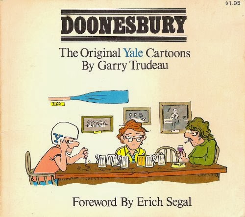
Orientation day at Long Island University's C.W. Post campus found me leaving a message in the mailbox of the Editor of their campus newspaper The Pioneer, requesting a meeting to discuss providing some kind of comic art on a bi-weekly basis. My request was received with success, and I was given carte blanche on the subject of a traditional, four-panel comic strip. My notion was that, naturally, college students would be be most interested in reading  about college students. But satire on college life featuring a bunch of eighteen-to-twenty-somethings seemed like the type of thing that's been done in a lot in college newspapers (most notably Garry Trudeau's Doonesbury predecessor Bull Tales at Yale and Jeff Shesol's Thatch at Brown University.) 

Garry Trudeau's Doonesbury Began Life at Yale as Bull Tales
Image Courtesy of The Hipster Dad Bookshelf 
 © 2013 G.B. Trudeau

The concept that I decided on was a campus setting surrounding new characters, incorporating an anthropomorphic dog character named Bill, intended for another comic strip idea. A few years before "prequel" became a part of the pop culture lexicon, I slimmed down his appearance and dialed back the dog's age to be college appropriate, keeping the forthcoming timeline of the intended later comic strip intact.

Bill, My Faithful Canine Character Became An Unlikely, But Loveable Lead For a College-Centered Comic Strip
© 2013 by Dan Cunningham

Now I had an upbeat, cute, talking animal character and some yet-to-be conceived twenty-somethings. Why not give more texture to the thing and make one of them Bill's human girlfriend? If the species thing isn't the one-note joke every week, there could be comedic conflict there. So Rita was conceived as Bill's significant other.

I Used Them With RestraintBut When You Set Up a Premise Like This, Species Compatibility Gags Are Inevitable!
© 2013 by Dan Cunningham

What Kind of Girl Dates a Dog?

From the start, I knew Rita shouldn't be too prissy, nor overly brusqueshe had to be a strong, wise girl coming of age in the 1990s. She also had to be open-minded enough to date a talking dog (which wasn't necessarily a new idea: Berke Breathed's Opus the penguin frequently dated human females in Bloom County, and we all know Gary K. Wolf's Roger Rabbit married the buxom, human Jessica Rabbit.) But Bill and Rita's personal dynamic and campus life would be the focus of the strip.

 Despite The Many Odds Against Them, It Had To Be Clear Bill and Rita Genuinely Adored Each Other
© 2013 by Dan Cunningham

Knowing that much about who she needed to be, Rita's design process was based on an technique long-used by professional cartoonist and animation artists: the "silhouette test" which is used in two capacities:

To enable a character with designs rendering their contour shape recognizable, even in silhouette...

Instantly Recognizable and Clearly Defined Silhouettes of Famous Cartoon Characters
Image Courtesy of Frederator Studios

... and establish poses clear enough that a character's action is readable.

 Figure A Shows Jiminy's Action Clearly, and Reads Better as Both a Standard Line Drawing and in Silhouette
Image Courtesy of Animator Mag Library
© Disney

Using this method led to Rita's slim frame, shorter hairstyle, and the up-lifted spit curl at the center of her hairline. She'd stand out as female in silhouette, but slightly askew of more fashionable girls her age. Though the strips never appeared in color, Rita's hair is platinum/bleach blonde to the point of pure white with the slightest tint of pale yellowin my mind, it set Rita further apart from her peers as a level-headed, but quiet, rebel. This design process helped define her personality, before any actual writing began.
 

An Early Strip From 1996 Shows Easy-to-Read Profiles of the Main Characters (Preceding a Slow Climb Towards Better Drafting, Steadier Line Art and Clear Hand-Lettering)
© 2013 by Dan Cunningham

Bill & Rita was an early effort on my part, and the early strips are hard to look at without extreme scrutiny, despite the strong personalities of the characters. However, as each strip progressed, I figured out more about using a nib pen with a jar of Windsor-Newton ink, attempting clearer hand-lettering, placement of line weights and trying zipatone screens. By 1997, things became more polished and proved true the advice of Charles M. Schulz on starting a new comic feature: "Draw fifty strips, throw them away, and then start again."

Bill & Rita Today
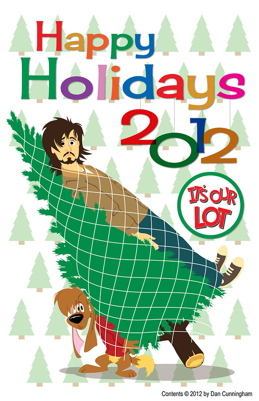

These Days, Bill Provides Hi-Jinks in My Annual Holiday Card (Along With the Slightly Less Hairy Chap Pictured Above)
© 2012 by Dan Cunningham 

Bill & Rita had a definitive conclusion once I received my diploma, and the artwork largely laid in a envelope as something of an afterthought as I quickly paved my way into the professional world of commercial art. Of course, the dog continues to play a role of canine mascot in my annual custom Holiday Card, and it's possible I'll post the entire college run of Bill & Rita here someday, most likely via a remarkable online book format recently directed to me by none other than renaissance man and friend of the blog, Joseph Cowles.

Beyond revisiting the original strips, there may be a future for the cast of Bill & Rita: for once their personalities and relationships solidified, I found they often wrote themselves. I've sporadically toyed with the idea of a new graphic novel in strip format:

 Thumbnail Concepts For a New, Book-Length Story: Bill & Rita in Abnormal Spring Formal
© 2013 by Dan Cunningham 

Should such a project come to pass, you'll certainly hear about it here. For the record, I'd still place it in those years of the mid-1990s, the final era to depict college life before technology commanded primary social interactions. All done with a promise of much-improved artwork/drafting, and the benefit of color.

Thursday, November 29, 2012

A Rare Citrus Treat

The Orange Bird
Illustration by Dan Cunningham, © Disney
Medium: Vector Art in Adobe Illustrator

When Walt Disney World opened in late 1971, the resort could claim many unique featuresmost notably in the categories of size, transportation and recreational offerings compared to the original Disneyland in Anaheim, CA.

Florida Residents and Tourists Could Preview a Detailed Scale Model of the Walt Disney World Resort Prior to the October 1971 Opening
Image © & courtesy of Flickr user BestofWDW

However, much of the content within the theme park was a reflection of those found in Anaheim. The initial plan was for Walt Disney World's Magic Kingdom to feature a similar layout to Disneyland, debuting new, different attractions mixed with a selection of shared ones. During construction, time and budget crunches weakened the brew, leaving Florida only a handful of unique attraction offerings.


A Preoccupied Hollywood Legend Debates Original Attractions vs. Clones While Surveying Construction Progress
Image © & courtesy of Flickr user BestofWDW

Over the decades, with the global sprawl of Disney's domestic and international theme parks, a homogenization of elements became de rigueur. This, plus the accumulated experience of customer trends and market research aided a justification for overall consistency with fewer touches proprietary to a single area.

What marketing surveys and polls can't always nail is the nostalgia factor. User-controlled media the likes of fanzines, message boards, podcasts and blogs wield the ability to raise eyebrows and awareness of even the most trend-savvy analysts. It is largely due to the breadth of the internet that some things, deemed worthless, regain their capitalization potential and find their way back into the public consciousness.

 Demographic Surveys Rarely Factor in Kitsch or Nostalgia
Image courtesy of snapsurveys.com

Those of us who watched television commercials and spent time at Walt Disney World during the 1970s have recently been reunited with a familiar friend. Spring 2012 restored a seemingly simple and largely forgotten icon from the tangerine-hued ether, as the Florida Orange Bird resumed his place behind the Magic Kingdom's Sunshine Tree Terrace snack counter.


Over 25 Years Later, The Orange Bird is Back Where He Belongs
Image courtesy of Eating WDW Blog

Despite the burgeoning homogenization factor, the Orange Bird's restoration signaled an stabilizing modicum of individuality to Walt Disney World. He is one of the only unique icons of the resort's history: a distinct identity that was never copied anywhere else.

Beyond being represented on a sampling of new merchandise, the loveable avian/citrus hybrid adorns a large attraction poster under a main entrance tunnel into the park, and atop the "throwback" marquee, with proper font restored in place of the prior (and rather generic) interim typeface.


A Visual History of The Sunshine Tree Terrace Marquee
© Disney

The cost and effort behind the return of something as unremarkable as a long-discontinued, 40-year old Florida Citrus Commission mascot speaks volumes on the impact of user-based media. Minus the online recognition by those who simply remembered the character fondly, the formal reestablishment of The Orange Bird at Walt Disney World would never have surfaced*.

I won't go into a great deal of background on the character here, as there have been a multitude of resources online over the past few years chronicling the Bird's history and return. The most notable and informative of these you can discover in the following links:

Widen Your World was the first website to provide a solid, well-researched overall history of the character:

Jim Korkis, Disney Historian and author of the excellent The Vault of Walt and Who's Afraid of Song of the South & Other Forbidden Disney Stories, placed his research efforts and eye for detail on the Bird's notoriety with three posts, spanning five years via MousePlanet:

Mr. Korkis has also put up another post at Jerry Beck's Cartoon Research site, with information on the Bird's singular animated short film Foods and Fun: A Nutrition Adventure for Walt Disney Educational Media, produced by Rick Reinert Productions (including a full video of the short):

The eloquent Michael Crawford at Progress City U.S.A. provides further history with a thoughtful essay on the impact of the character's relationship to Walt Disney World during the resort's challenging early years**:

FoxxFurr's Passport to Dreams Old and New covers more in-depth history and provides intelligent insight on the practical character design aspects, and the character's overall aesthetic appeal upon the 2012 return of The Orange Bird:

Over at Miehana, the talented Kevin Kidney briefly recounts his participation in uncovering the hidden location and restoration of the original Orange Bird figurine, and a good look at the improved paint finishing bestowed upon it:

My own early online efforts were on display in 2007, when I created custom desktop wallpaper for Jeff Pepper's exemplary 2719 Hyperion blog:

A Rare AUDIO Citrus Treat


 Magical Memories Magazine #1
The Premiere Issue of Jesse Guiher's Audio Fanzine, Photo © by Dan Cunningham

Nearly a decade ago, I was fortunate enough to purchase a rare gem of the aforementioned user-based media. At that time, a search on the subject of The Orange Bird garnered scant results, save for a few crumbs of information and a heaping teaspoon of items on eBay. One afternoon, I noticed a message board posting with an ad for the premiere issue of Magical Memories Magazine, an audio fanzine consisting of 2 CDs with narrated content about a particular theme park attraction. Here was user-based audio which predated the podcast explosion to come, about a year later. MMM #1 was themed to The Enchanted Tiki Room of Disneyland (Disc 1) and Walt Disney World (Disc 2), with ornate packaging and inserts.


MMM #1 Was a Feast of Visual & Audio Ephemera
Photo © by Dan Cunningham

The 'zine did not feature attraction audio, opting for original content: in-depth history on the mid-century tiki craze, stories and recollections from those who'd worked and maintained The Enchanted Tiki Room on both coasts, an exclusive interview with Disney Legend X. Atencio, and... a thirteen-minute audio history of The Florida Orange Bird.

All this was constructed and offered by a gentleman named Jesse Guiher: an ambitious Oregon-based artist and designer. I contacted Jesse earlier this year, and got a bit of background on the history of his Magical Memories Magazine project (two other issues followed before he ceased production, MMM #2 focused on the Disneyland Haunted Mansion Holiday overlay, and MMM #3 looked at the myriad attractions inspired by 20,000 Leagues Under the Sea).
"I only had one other person to help with the 'zine, so it was a long, laborious process to do each issue, as I did everything from interviews to editing to graphic design and art, it was a lot of fun but such a great deal of work that I didn't have time for anything else. [I]ronically, it was the beginnings of success that killed the 'zine: I couldn't fulfill the orders fast enough [or] on time, once they started pouring in on the third issue."
– Jesse Guiher, May 2012
Jesse also very generously gave me permission to post the long out-of-circulation Orange Bird History audio (note: history covers the years 1970–2004) here for everyone to enjoy. All participants on MMM #1 used pseudonyms, with the exception of Jesse himself, who took on the role of host and interviewer throughout the 'zine. The author and narrator of The Orange Bird History audio is known as "Howard"hit the play button to listen right here:


Or download the MP3 HERE

Jesse is currently working on a new kids noir web comic, and you can see samples of his artwork over at TigerTailArtmake sure you tell him thanks for sharing! 
* To be fair, the only other potential factor was a merchandise push of the character in the early 2000s to Japanese consumers (be sure to read the Widen Your World article for details.)
** Crawford's post speaks of the loss of the character: his post was published in November 2011, unknowingly foreshadowing the Bird's return to the Sunshine Tree Terrace in April 2012.

Sunday, September 2, 2012

Laguna Beach: Surprises Around Every Corner

A solo August trip to Southern California afforded me time to do quite a bit of leisurely driving. In the early evening, I could be found departing a particular strip of beach, sporting a fresh coat of sand and sunscreen, south-bound on the Pacific Coast Highway en route to the seaside city of Laguna Beach. The desire to return nightly was due to the unique character of the town center immediately off of the PCH.

Heading Down the PCH Towards Laguna Beach
Image © and courtesy of Wikipedia

Ordinarily, the main highway facing the ocean on most beach enclaves boast commerce to meet the basic beach-going needs: counter service hamburgers and frozen yogurt, swim/surf wear shops, and endless marketplaces offering sunglasses, T-shirts and souvenirs. The shores of Laguna had these in great numbers, but included an eclectic sampling of high-end shops, galleries, a dedicated art museum, and strikingly varied architecture. Compelled by a light wallet, an ATM visit one block east of U.S. 1 further revealed a stylistically diverse, yet quaint and cozy thoroughfare. Upon parking, this single city block compounded the passing curiosities glanced from the highway tenfold.


 The Lumberyard Restaurant
Image © by Dan Cunningham

Strolling northeast, on 384 Forest Avenue you'll find the Lumberyard Restaurant: a folktale Norman-styled building with wide, rounded eaves and gables. This eatery is one of Laguna Beach's most important historical buildings, named in tribute to the business the structure originally housed: the Laguna Beach Lumber Company.

The Original Laguna Beach Lumberyard 
Image © and courtesy of Silver Images,
from Arcadia Publishing's Images of America: Laguna Beach, CA

From 1912-1975, the Lumberyard was a vital component in the growth of the village. Prior to the Lumber Company's establishment, residents had to travel inland as far as Santa Ana to acquire wood to construct their homes.

The Lumberyard Restaurant Today
Image © and courtesy of Google Maps

Adjacent to the Lumberyard restaurant lies a distinctive shopping plaza that meanders through small courtyards. Public tables, chairs and benches are thoughtfully shaded by umbrellas and handsome mature trees. The plaza and its immediate environs evokes notions of a charming European village—a contained, multi-level layout invites discovery and provides a refreshing contrast to the exhausting linear storefronts of modern shopping centers and commercial streets. Stretches of unconventional brickwork offer a distinctively hand-hewn look, resulting in delightful chaotic uniformity.

 Brickwork Won't Lay Down For Conformity
Image © by Dan Cunningham

Around the block from the Lumberyard, at 260 Ocean Avenue sits another treasure: the Laguna Beach branch of Wells Fargo Bank. This was originally the Home Office of Laguna Federal Savings and Loan Association, founded in 1935.

Vintage Postcard of Laguna Federal Savings and Loan Association
Image courtesy of eBay user 100fishhooks

This Federal-style building with front-facing balconies and detailed wrought-iron work looks as if it came directly out of a New Orleans set of blueprints. The bank certainly has its share of admirers—during my walks I often saw passersby stop to take photos.

The Building Today: Wells Fargo Laguna Beach Branch
Image courtesy of Flickr user michaelje0

The bank not only dutifully provides financial services and enhances the architectural landscape, it also regularly plays host to displays of public art on the 3rd floor.

Festival of Arts Gallery on the 3rd Floor of the Wells Fargo Building
Image © and courtesy of Sparkle Films

These buildings are just two examples of what I saw during short visits. The town is bursting with uncountable unique hand-crafted works, from homes and businesses, to fountains, signs and lampposts. The roots of its early 20th century artist colony are firmly planted in Laguna's character and culture.

At the immediate edge of town, at the mouth of Laguna Canyon sits the home of the Sawdust Art & Crafts Festival and the Festival of Arts open-air gallery—sprawling outdoor showcases of skilled artists with work on display and in production.

Open-Air Art Festivals Offer Something For Everyone
Image © and courtesy of Laguna Beach Independent

This area is also the location of the annual Pageant of the Masters—an exhibition featuring incredible re-creations of classical and contemporary art works, utilizing real people posing to look exactly like their counterparts in the original pieces.

A Live Subject is Prepped For The Annual Pageant of the Masters
Image © and courtesy of Madison's I'd Rather Be Eating blog

A return visit to experience these events is a gleeful certainty. When traveling, I've always subscribed to the axiom of "When seeking local flavor, the greatest resource is the locals themselves." One resource I've come to revisit often is Kate Buckley's Laguna Beach Blog. While Kate's blog is still fairly new to the 'net (just as we are here) she offers great detail and insight to the events, attractions and denizens of Laguna Beach. While the sand and surf are the main draw of Laguna Beach, there is much more to do and see directly off the coastline of this cultural cornerstone of Southern California.

Monday, June 11, 2012

Vintage Wallpaper of Disneyland

Disneyland Paper Bag Shirt (2010)
Designed by Kevin Kidney & Jody Daily
Image © The Walt Disney Company

One of my favorite blogs is run by one of my favorite artists. Well, one-half of a team of my favorite artists. Kevin Kidney frequently updates and showcases art and development work created by himself and his partner Jody Daily. Do you like attractive art, colors and design? How about the Tiki Lifestyle and Mid-Century living? Want a taste of the history of Illustration, Southern California, and the many creative divisions of the Walt Disney Company you'll won't find anywhere else? Then jump over to visit Kevin's Miehana Blog.

A small sampling of Walt Disney Collectibles created and designed by Kevin Kidney & Jody Daily

In the past decade, Kevin and Jody have designed some of the most successful and sought-after collectibles for Walt Disney Consumer Products and Theme Parks. Their 2005 line of limited edition merchandise for the 50th Anniversary of Disneyland represent an outstanding example of high-quality items that achieved elegance and whimsy is a single swipe. Over a multi-month roll-out, each set of collectibles offered sold out quickly, many in a matter of hours. Since then, Kevin and Jody have been commissioned to produce more lines of collectibles for The Disney Theme Parks, commemorating milestones such as the 55th Anniversary of The Mickey Mouse Club, and the 40th Anniversary of the Walt Disney World Resort.

The project detailed in the image heading this post was another Kevin and Jody creation: a casual, button-down shirt utilizing graphics from an early Disneyland paper shopping bag. The artwork is stylized fun, and bears a color palette straight out of a mid-fifties swatch book.

My vector art recreation of the original graphics 
Image © The Walt Disney Company

For an exercise, I decided to use the artwork from that image and re-create it as faithfully as possible. Which brings us to the purpose of this post: I've taken that vector art and created some wallpaper images for any of you to download here: Disneyland Wallpaper

There's six size formats to choose from, so one or more will surely accommodate your device(s):
  • 240x320 (Android Phone)
  • 320x480 (iPhone)
  • 1024x1024 (iPad)
  • 1024x768 (Standard Screen)
  • 1680x1050 (Widescreen)
  • 1920x1080 (Full HD)
Go take a look, download, and enjoy! Then make sure you drop by Kevin Kidney's Miehana* blog, unless you don't care to be thoroughly entertained and delighted.

* Dunno what a "Miehana" is? It's "Anaheim" (the Southern California city where Disneyland is located) spelled backwards! The Miehana was a special Rum-based cocktail created by Jeff "Beachbum" Berry for a 1996 exhibit of Polynesian style in the Anaheim Museum. It was later honored in 2004 by an exclusive Tiki mug designed by Kevin and Jody.

Tuesday, March 13, 2012

UPA on DVD Coming March 15th


From the late 1940s through the mid-1950s, some of the most imaginative and ground-breaking animation emerged from a studio called UPA (United Productions of America). Their Academy Award winning animated short subjects were theatrically released by Columbia Pictures. UPA is probably best known as the creators of Mr. Magoo* and the animated adaption of Gerald McBoing-Boing by Theodor "Dr. Seuss" Geisel. However, their oeuvre is as eclectic as a patchwork quilt on Jackson Pollock's studio floor. The contemporary feel and unlikely sources (adapting the work of authors such as James Thurber, Edgar Allan Poe, and Ludwig Bemelmans) boldly set the studio apart. This gave UPA bragging rights as animation for the intellectual set.

UPA boasted a mighty talent pool of master animators, writers, and designers who pushed the envelope of "safe" studio animation design to reflect post-modern art and mid-centutry graphic sensibilities. Their creative team generates a list of animation who's-who. Here is a mere sampling of contributors to the UPA shorts: Jules Engel, Bill Scott, Bill Meléndez, Bobe Cannon, and John Hubley (a remarkable animator about whom I plan a lengthy post). These pioneers of the golden age of animation contributed largely to forging the art style which has come to be known as "Cartoon Modern."**


On March 15, the original UPA shorts are being released together on DVD for the first time courtesy of Turner Classic Movies and Sony Pictures. UPA - The Jolly Frolics Collection consists of 3 discs containing 38 theatrical shorts, each remastered and many featuring restored titles. The set has been overseen by Film Authority and Historian Leonard Maltin and Animation Historian Jerry Beck, who have also contributed audio commentaries on selected cartoons. It is exclusively available at TCM's website here: UPA Jolly Frolics DVD, where the list price has been marked down to from $39.99 to $34.99. If you sign up for TCM's mailing list here, you can order the DVD and any of their great movies for an additional 10% off your order. Go, man, go!

* You will find one Mr. Magoo cartoon here, the character's debut short Ragtime Bear - but the complete theatrically released UPA Magoo series will have a home on an official Shout! Factory release this June. You can check out the specs of that DVD set on Amazon: The Mr. Magoo Theatrical Collection (1949-1959).

**  More about this art movement of the 1940s through the 1960s can be found at Amid Amidi's blog: Cartoon Modern.