A 1998 Sample of My College Newspaper Comic Strip Bill & Rita
© 2013 by Dan Cunningham
© 2013 by Dan Cunningham
One-Sheet Teaser Poster for Walt Disney Animation's Upcoming Feature Frozen
Image Courtesy of moviepilot.com
© Disney
Initial marketing and advertising campaign has commenced for the forthcoming animated feature Frozen from the Walt Disney Animation Studio (slated for U.S. release on Thanksgiving week of 2013.) Having witnessed Frozen preliminary art and teaser trailers that trickled out over the course of the summer, I was impressed with the scope and charm of the animated film, but never lingered enough to take a good look at the design of one of the lead characters until about a week ago.
One-Sheet Poster of Elsa the Snow Queen From Frozen
An online image of Frozen poster art centered on one of the female lead characters stopped me in my tracks. I recognized a design I quite liked, for reasons I wasn't sure of. It soon hit me that Elsa the Snow Queen looked remarkably familiar to something linked to my own past...
A Good Look at Elsa From Frozen Sparked Warm Memories of Rita
Can you can see why? Not just in the design of an attractive girl, but the hairstyle? Minus the braid, Elsa bears a striking resemblance to the female lead character of my own Bill & Rita. Of course, this is a coincidence of design choice, not a "lift" by anyone at Disney Animation.
In fact, that's downright impossible: each Bill & Rita strip was only published once—well over a decade ago to a tiny audience, via a minimal-circulation campus newspaper. Nor has it had a public presentation since. But seeing Elsa inspired me to share a bit about the conception of the strip, and some thoughts about character design in general.
Who Are Bill and Rita?
In 1996, a decision was made to transition from art school to complete my college education at an actual University. The timing would be my only opportunity to do so at an appropriate age: continuing an art degree by way of broadening my academic horizons and more intellectual pursuits. The bohemian atmosphere of an art-focused college was unique, but couldn't replicate the experience of large ivy-covered halls, school Football games, or the opportunity to get involved in a college newspaper.
Bill & Rita Appeared in C.W. Post's Student Newspaper, The Pioneer From Fall 1996 to Spring 1998
Orientation day at Long Island University's C.W. Post campus found me leaving a message in the mailbox of the Editor of their campus newspaper The Pioneer, requesting a meeting to discuss providing some kind of comic art on a bi-weekly basis. My request was received with success, and I was given carte blanche on the subject of a traditional, four-panel comic strip. My notion was that, naturally, college students would be be most interested in reading about college students. But satire on college life featuring a bunch of eighteen-to-twenty-somethings seemed like the type of thing that's been done in a lot in college newspapers (most notably Garry Trudeau's Doonesbury predecessor Bull Tales at Yale and Jeff Shesol's Thatch at Brown University.)
Garry Trudeau's Doonesbury Began Life at Yale as Bull Tales
Image Courtesy of The Hipster Dad Bookshelf
© 2013 G.B. Trudeau
The concept that I decided on was a campus setting surrounding new characters, incorporating an anthropomorphic dog character named Bill, intended for another comic strip idea. A few years before "prequel" became a part of the pop culture lexicon, I slimmed down his appearance and dialed back the dog's age to be college appropriate, keeping the forthcoming timeline of the intended later comic strip intact.
Bill, My Faithful Canine Character Became An Unlikely, But Loveable Lead For a College-Centered Comic Strip
© 2013 by Dan Cunningham
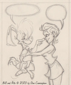
Now I had an upbeat, cute, talking animal character and some yet-to-be conceived twenty-somethings. Why not give more texture to the thing and make one of them Bill's human girlfriend? If the species thing isn't the one-note joke every week, there could be comedic conflict there. So Rita was conceived as Bill's significant other.
I Used Them With Restraint—But When You Set Up a Premise Like This, Species Compatibility Gags Are Inevitable!
© 2013 by Dan Cunningham
What Kind of Girl Dates a Dog?
From the start, I knew Rita shouldn't be too prissy, nor overly brusque—she had to be a strong, wise girl coming of age in the 1990s. She also had to be open-minded enough to date a talking dog (which wasn't necessarily a new idea: Berke Breathed's Opus the penguin frequently dated human females in Bloom County, and we all know Gary K. Wolf's Roger Rabbit married the buxom, human Jessica Rabbit.) But Bill and Rita's personal dynamic and campus life would be the focus of the strip.
Despite The Many Odds Against Them, It Had To Be Clear Bill and Rita Genuinely Adored Each Other
© 2013 by Dan Cunningham
Knowing that much about who she needed to be, Rita's design process was based on an technique long-used by professional cartoonist and animation artists: the "silhouette test" which is used in two capacities:
To enable a character with designs rendering their contour shape recognizable, even in silhouette...
Instantly Recognizable and Clearly Defined Silhouettes of Famous Cartoon Characters
Image Courtesy of Frederator Studios
... and establish poses clear enough that a character's action is readable.
Figure A Shows Jiminy's Action Clearly, and Reads Better as Both a Standard Line Drawing and in Silhouette
Image Courtesy of Animator Mag Library
© Disney
Using this method led to Rita's slim frame, shorter hairstyle, and the up-lifted spit curl at the center of her hairline. She'd stand out as female in silhouette, but slightly askew of more fashionable girls her age. Though the strips never appeared in color, Rita's hair is platinum/bleach blonde to the point of pure white with the slightest tint of pale yellow—in my mind, it set Rita further apart from her peers as a level-headed, but quiet, rebel. This design process helped define her personality, before any actual writing began.
An Early Strip From 1996 Shows Easy-to-Read Profiles of the Main Characters (Preceding a Slow Climb Towards Better Drafting, Steadier Line Art and Clear Hand-Lettering)
© 2013 by Dan Cunningham
© 2013 by Dan Cunningham
Bill & Rita was an early effort on my part, and the early strips are hard to look at without extreme scrutiny, despite the strong personalities of the characters. However, as each strip progressed, I figured out more about using a nib pen with a jar of Windsor-Newton ink, attempting clearer hand-lettering, placement of line weights and trying zipatone screens. By 1997, things became more polished and proved true the advice of Charles M. Schulz on starting a new comic feature: "Draw fifty strips, throw them away, and then start again."
Bill & Rita Today
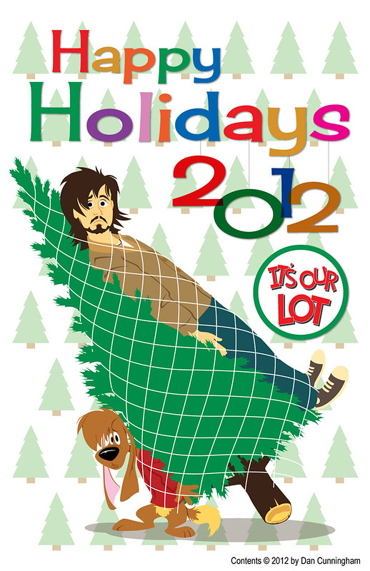
These Days, Bill Provides Hi-Jinks in My Annual Holiday Card (Along With the Slightly Less Hairy Chap Pictured Above)
© 2012 by Dan Cunningham
Bill & Rita had a definitive conclusion once I received my diploma, and the artwork largely laid in a envelope as something of an afterthought as I quickly paved my way into the professional world of commercial art. Of course, the dog continues to play a role of canine mascot in my annual custom Holiday Card, and it's possible I'll post the entire college run of Bill & Rita here someday, most likely via a remarkable online book format recently directed to me by none other than renaissance man and friend of the blog, Joseph Cowles.
Beyond revisiting the original strips, there may be a future for the cast of Bill & Rita: for once their personalities and relationships solidified, I found they often wrote themselves. I've sporadically toyed with the idea of a new graphic novel in strip format:
Thumbnail Concepts For a New, Book-Length Story: Bill & Rita in Abnormal Spring Formal
© 2013 by Dan Cunningham
Should such a project come to pass, you'll certainly hear about it here. For the record, I'd still place it in those years of the mid-1990s, the final era to depict college life before technology commanded primary social interactions. All done with a promise of much-improved artwork/drafting, and the benefit of color.


Bill and Rita might be my new favorite couple! Besides the fact that they're adorable together it's also very clear that they're smitten with each other! An odd pairing that makes complete sense. I can't wait for the graphic novel!
ReplyDeleteThank you, Audrey! Nice to have a new audience enjoying them... these characters have been hiding for quite a while!
ReplyDeleteShould further info or something new come around centered on Bill & Rita, you'll hear about it here - Dan